In 2024, a few things have become abundantly clear: the jocks vs skaters dialogue has entered unprecedented territory, Mies van der Rohe unintentionally designed all the best skate spots, and every brand affiliated with skate culture needs to have a metal inspired logo, or at the very least, a graphic reminiscent of metal tropes.
Visual trends come and go - it wasn’t that long ago that all brands were similarly seemingly mandated to have a championship ring graphic. So, in 2024, why do we see so many metal logos? What follows is a chronology of cultural happenings that have brought us to this place.
Phase 1: Origins, Foundations, Skulls, Goblins - 1980s-1990s
The visual language around heavy metal has its own rich history, but that’s not what we’re here to talk about. We’re talking about skate-related brands using dark / skull / demon / goblin graphics and heavily stylized typography reminiscent of of how one would expect a metal band’s name to be presented graphically to sell skateboards and / or t-shirts.
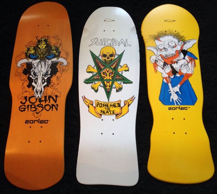
One doesn’t need to dig too deep to find skateboarding using visual language of this type prominently: Zorlac graphics of the 80s were about as metal as it can get, coming from an authentic place within the Dallas music / skate scene. Launching the career of Brian ‘Pushead’ Schroeder, and real, actual a collaborations with Metallica, Zorlac was legitimately metal. Following Zorlac’s lead, Powell Peralata mainstreamed the use of skulls and daggers, leading to the establishment of metal-esque iconography (albeit a slightly more family-friendly version) as a trope within skate culture.
The years that followed saw brands like Zero and Creature waving the flag of dark graphics and type, further solidifying a space for this look within skating, but still occupying a niche space in the industry.
Phase 2: A Spotlight on the Obscure - 2005-2013
In order to understand how we’ve gotten to mass-market metal, we need to step out of skating a little and forward in time from our last step. In the late 2000s into the early 2010s, most of youth culture, whether we’re talking about what was happening on the Lower East Side in general or what’s now being referred to sweepingly as the indie sleaze scene (don’t blame us for this terminology), the currency of the day was having one’s photo taken. Blame (or thank!?) Tumblr for this. This phenomenon prioritized the donning of eye-catching apparel, and what’s more eye catching than a metal tee? What says “I know about something profoundly epic that you don’t know about” more than a metal tee? What started at Max Fish quickly made its way to LA DJ parties, and it wasn’t long before metal tees were everywhere. The strong graphic look overtook even the requisite of knowing anything about the band, much to the consternation of true metal fans. Why? As Internet-based culture ramped up, it did what internet culture does: it shone light on even most obscure corners of culture and turned them into social capital.
The metal tee became established as a signifier of hipness (again, whether or not its wearer was familiar with the band being advertised). Fast forward a few years and something truly interesting happens: the Yeezus phenomeon. This could be expanded upon in a post of its own, so here’s the shorthand: metal tees have been in the cool cycle for a few years, Kanye West reaches peak popularity, Kanye West goes on tour and makes metal tees because that’s what cool people are wearing. Metal tees become their own thing entirely, detached from even the music that spawned them.
Phase 3: (My Work Exits at) The Intersection of Nostalgia and Hype - 2013-2020
There’s a commonly held belief that fashion trends are subject to a 20 year cycle. In some ways this trend cycle has broken in recent years, but in other ways, some things just stay the same. The 2020s have seen plenty of nostalgia for the early 00’s, an era when there was plenty of dark energy in mass market fashion. Hype for the styles of 20-ish years ago combined with the generational angst that comes with coming of age during an era of increased civil unrest and economic uncertainty has primed an enthusiasm for dark imagery. Additionally, every generation feels a duty to disrupt the sensibilities of the previous generation, so why not fuck up some clean, millennial-friendly branding with the chaos of a metal logo?
Phase 4: Forged Amidst the Zeitgeist - 2020-2022
The aesthetic output of anyone starting their brand / video series / whatever is subject to the overarching visual trends of the current time. When we get to our current decade, a noted degree of darkness, or at least chaos, prevails amongst creative output. This leads to plenty of metal-looking logos. Examples:
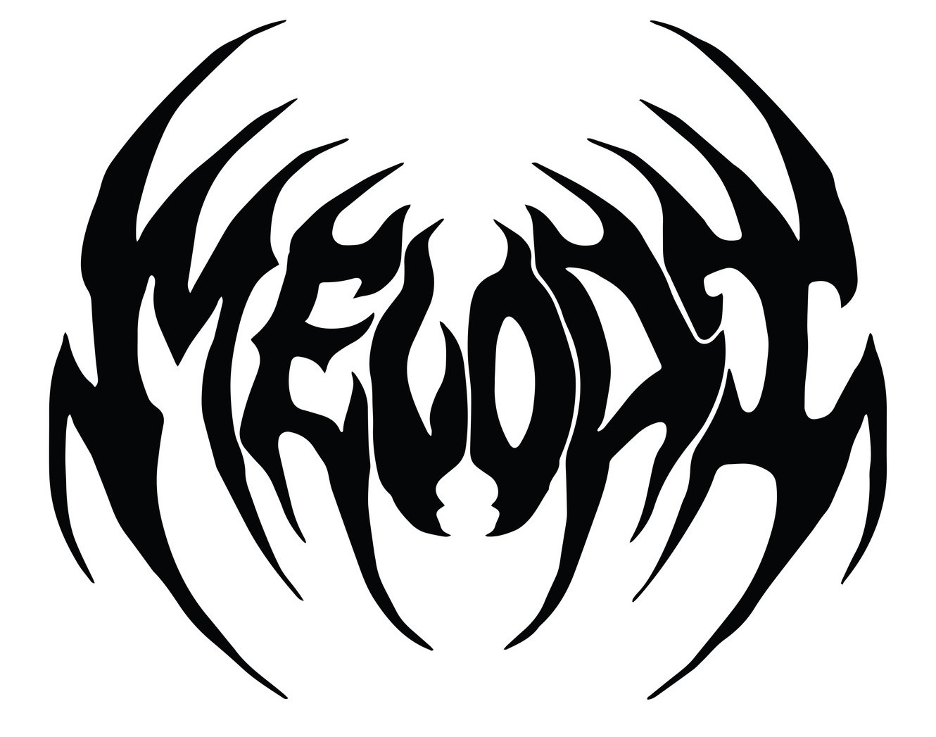
EC Melodi came of age amidst the prominence of the metal aesthetic, so it’s not surprising that they’ve ditched their original logo for a logo with a very metal-orieneted logo.
Late Night Stars’ primary brand mark is a less on-the-nose nod to the metal aesthetic, but is quite reminiscent of logo used by the 90’s crust/sludge band Dystopia. Not necessarily metal, but metal adjacent and chaotic nonetheless.
Limosine’s brand marks fall into a similar category, more visually similar to type used on early emo records. Not metal, but exhibiting a loose, chaotic style. Not necessarily dark, but definitively not cheery, and pairing exceptionally well with the music used in Limosine edits.
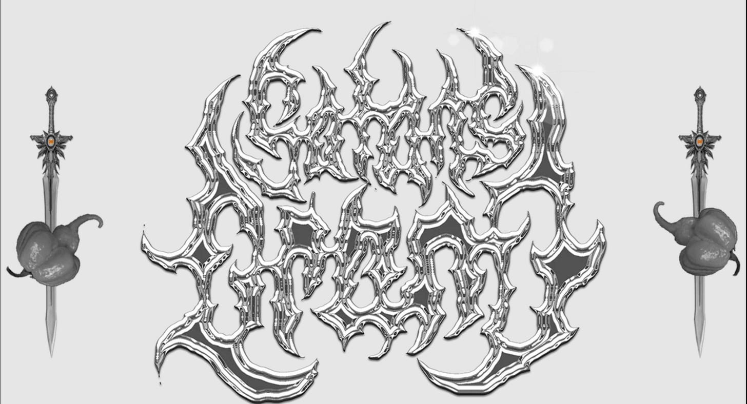
Satan’s Drano is the product of people who are actually just really into metal. Their logo falls into line with the hype, but is undeniably authentic.
Phase 5: Inevitable Mass Market Marketing - 2024
Phase 5 brings us to the point where because many of the most culturally relevant creative endeavors of the last 5-ish years all have metal looking logos and associated imagery, brands that have already established themselves firmly in the mainstream begin adopting this visual approach because, well, that’s what the kids are doing. Examples:
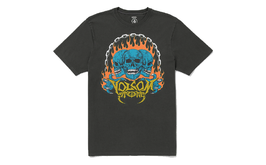
Volcom, a brand carried at Pac Sun and Pac Sun-lke retailers worldwide, tends to go for a flavor-of-the-week approach to tee graphics, so it’s no surprise that they’ve pulled out the metal graphics for Fall ‘24.
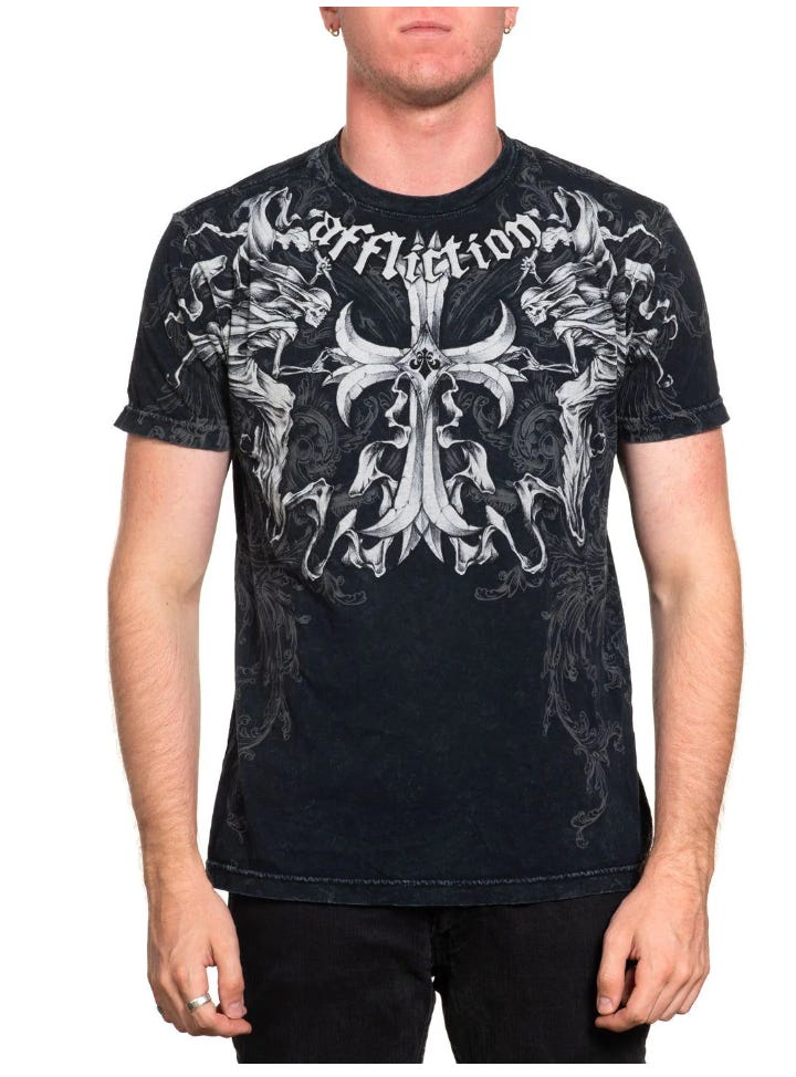
Affliction, the favorite t-shirt brand of UFC afficionados in the mid-aughts is now sold at Zumiez, giving credence to the concept of the 20-year trend cycle. It definitely wasn’t sold at retailers of this ilk its first time around, but now that metal (and nu-metal) iconography is currently a shorthand for ‘on trend’ (at least for this quarter), this makes total sense.
Similarly, Vitrol, a Zumiez house brand that seems to specialize in capitalizing on visual trends of the moment, is of course, selling a metal logo tee.
What does all this mean? Our take is that the phenomenon of metal logo as default brand mark is a product of internet culture taking all culture and commodifying it, its most obscure pieces of being of highest value. These pieces are initially used by those in the know, and in synthesis with products of a 20-year trend cycle, become a shorthand for brands who need relevance.


